ux-portfolio-spearsmike
UX Journal 1 - Monitor OSD
Michael Spears, 4/21/21
In this journal I will describe my interaction with my computer monitor’s OSD (onscreen display) and examine its strengths and weaknesses focusing on learnability, efficiency and error tolerance.
Background
A monitor’s OSD allows a user to change its many settings such as position, color balance, brightness, contrast, display input, etc. My monitor has the controls for the OSD at the bottom of the LCD panel.

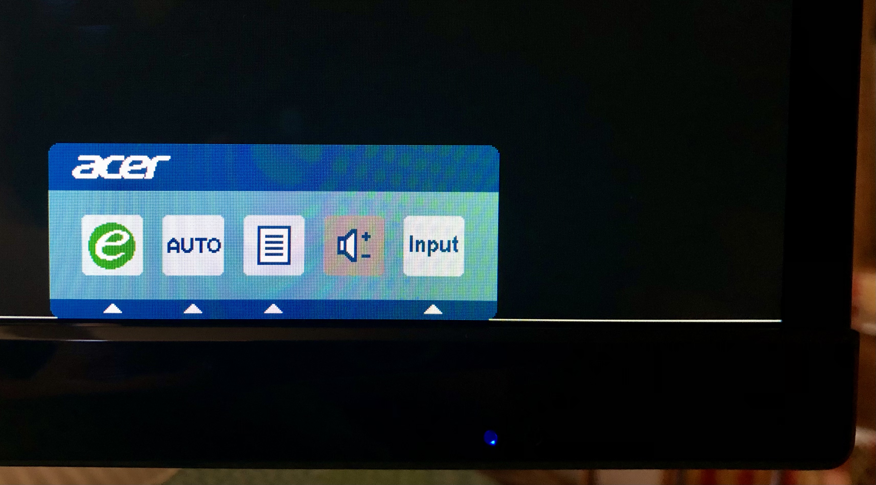
Pressing any of the bottom buttons (minus the power button) shows a menu with icons.
Narrative
I rarely change my monitor’s settings (twice a year at most) but I have recently tried to change the brightness. I started by pressing one of the buttons at the bottom of the display next the to the blue power light expecting to see a menu; instead, the monitor turned off. Annoyed, I turned the monitor back on, waiting several seconds for the display to light up. I pressed one of the buttons again, this time making sure not press the same right-most button that turned off the display. I’m greeted with a menu. I couldn’t remember what each of the icons did so I selected the paper sheet icon with one of the buttons to see what would happen. Nothing happened. I pressed it several more time until I realized that I was pressing the button that corresponded to the volume control (this monitor has no speakers). Realizing this, I pressed the next (correct) button and this menu appeared.
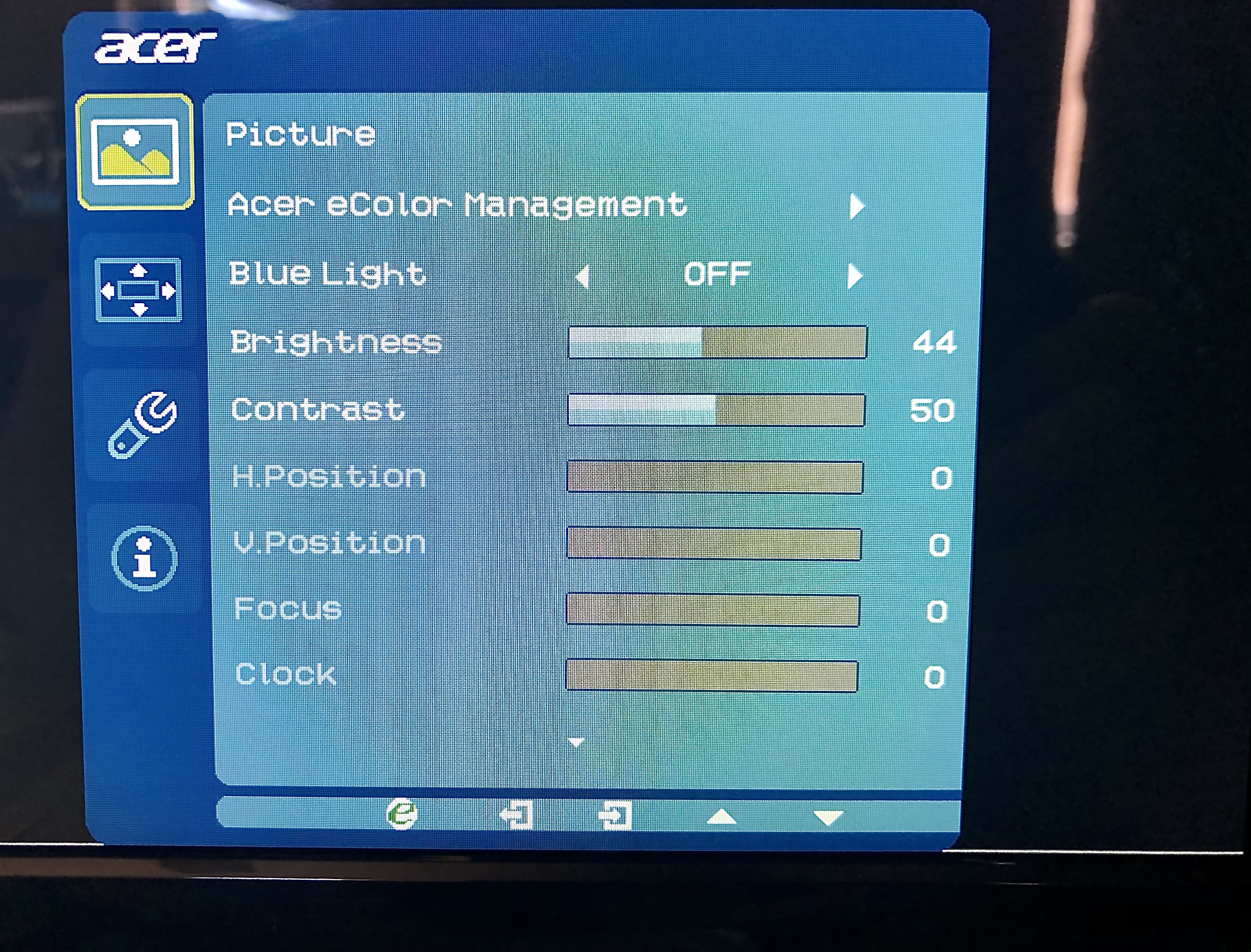
I searched the for the brightness slider but before I can find it the OSD vanished. I tried again using the same steps to get to the same menu. I’m able to find the brightness slider right before the menu vanishes again. I repeated the same steps again, this time paying attention to the bottom row of controls. I frantically pressed different buttons to figure out what they do before the OSD turned off. Along the way I pressed the power button several times on accident. Through trial and error, I figured out that the box and arrow icon was for selecting a setting to alter; and I was able to change the monitor’s brightness.
Analysis
Learnability
The OSD for my monitor has very poor learnability. Learnability is the ease in which a system can be learned. A system like the one analyzed, needs good learnability. Because of how infrequent the OSD is used, most won’t remember how to use it. The only thing I was able to remember was that the OSD is accessed using buttons on the bottom of the monitor. The timeout time for the OSD made learning difficult since the UI could disappear at any moment.
Efficiency
Once the system is proficiently learned it is reasonably efficient. Settings can be changed in under a minute. It can be more efficient if the timeout time is increased.
Error Tolerance
Error tolerance is how easy it is to remedy or undo an error. In this metric, the monitor scores low. The buttons used for navigating aren’t labeled. While the power button is labeled, it’s very hard to see (especially in low light) since the power symbol is embossed into the glossy black plastic and there’s providing no contrast. Another fault is that each button isn’t visible since they are on the bottom of the monitor and there are no differentiating features to the (size, shape, texture). Thus, a user must guess where the buttons are which is made more difficult by the fact that the buttons aren’t properly aligned to their onscreen functions. This misalignment is exaggerated when viewed at an oblique angle.
Other Thoughts
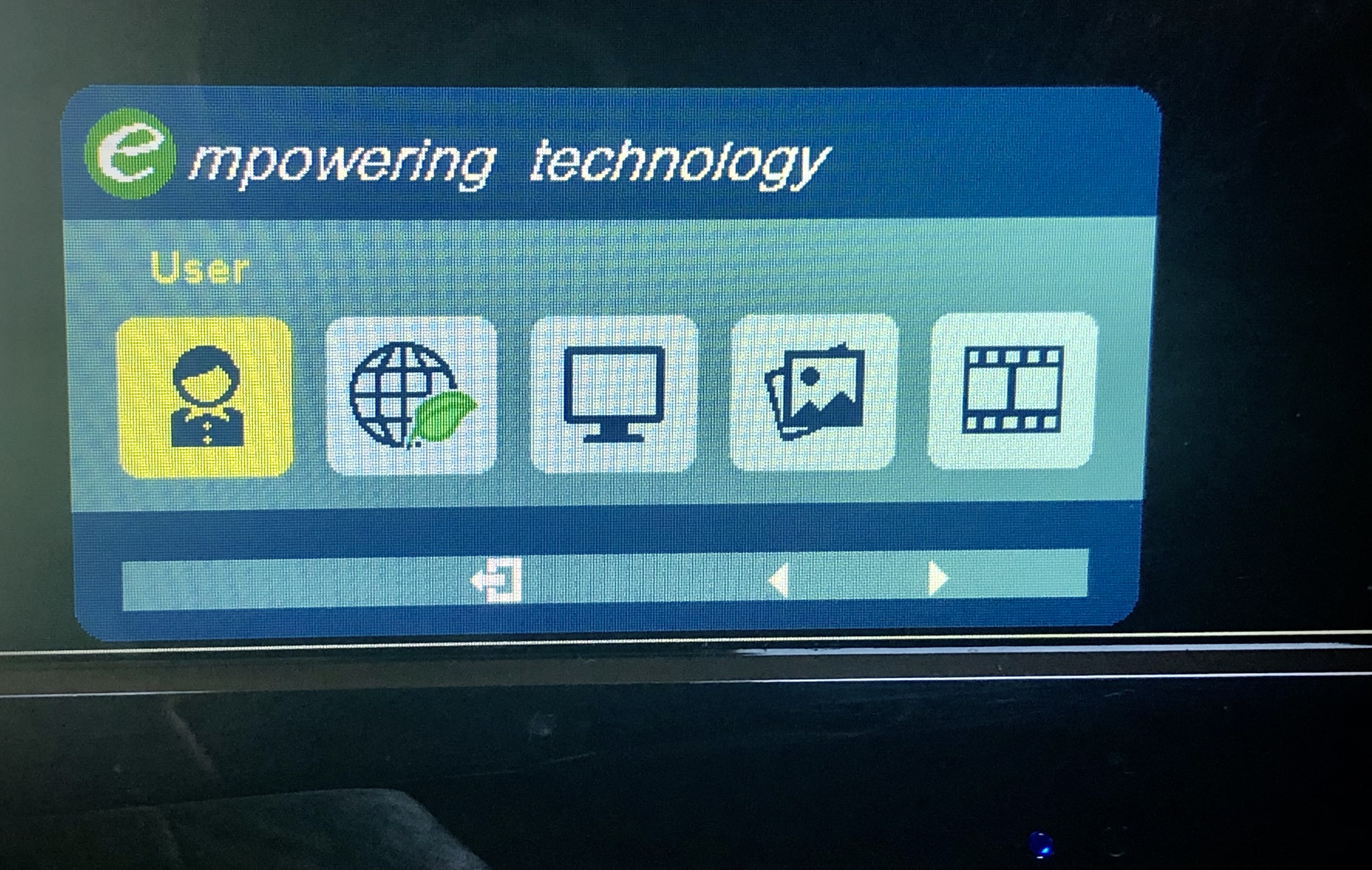
Conventions in design are common patterns, used in many other systems, to quickly convey meaning to a user. There are several examples in the presets menu. To the far right there is a film reel representing movies which implies that that setting is for watching movies. To the left of that is a photo icon for viewing photos. The second icon from the left uses a globe and green leaf implying that it’s an energy saving setting. This green leaf is a convention also used in Windows 10 to indicated the same thing.

Recommendations
The easiest change with the largest impact would be increasing the default OSD timeout time. While this time can be changed the default of ten seconds is too short. A new user trying to learn how to navigate through settings won’t have enough time to examine the UI. An improvement for the buttons could be moving them from the bottom to the front of the screen so users can see what they are pressing. If the controls must be along the bottom, make each button have a unique texture so they can be identified by feel and align each button to where the contextual onscreen buttons are.