ux-portfolio-maryjend
j02 - The Downfall of the Apple TV Remote
Mary Jendricks 5/11/23
In my family’s home we use the Apple TV console and remote, because we find all Apple products to be seemingly easy to use and consistent with each other. We made the switch to Apple TV from AT&T. The Apple TV remote is very unique, mainly due to its small size, lack of many usual buttons, and the use of a trackpad.


Because the Apple TV has very few buttons, and a trackpad, the learnability was very quick. When using a TV remote, my goal is to be able to easily switch from app to app, channel to channel, navigate to the main menu, navigate to my library, go back, etc.. Typically, remotes become something a typical user (me) can use without looking at each button for every command.
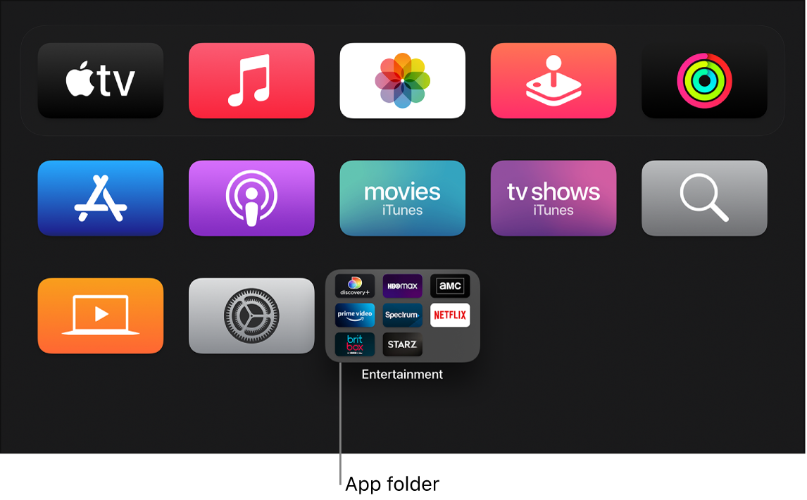
One action I as a user tries to perform often is to navigate to the home Apple TV menu when already in an app. To navigate to be within an app, you begin on a homepage with icons full of different streaming services, apps, and games.
When first adapting to this new remote, I expected the menu button to bring me to the Apple TV home page. But this is not the case. In reality, the menu button performs like a back button on a typical remote. The back button will bring the user from their current screen, to their previous screen.
Imagine I am within the app Netflix, browsing for a show, and decide I would like to watch House of Cards. After finding the show on Netflix I read the overview, and decided maybe this show is too much for me. The screen I am currently on looks something similar to

From this screen I decide to attempt to navigate to the Apple TV homepage in order to change apps and look for a new show.
I often use the app Netflix to stream my favorite shows, but as a user I like to navigate between netflix and other streaming services. When I am within the Netflix app, and wish to return to the Apple TV home menu, my first instinct is to press the button titled menu, illustrated below.
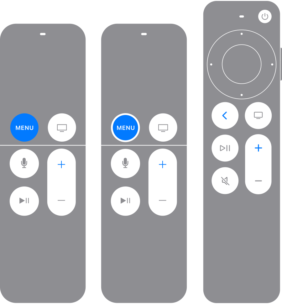
However, the Apple TV remote fails me as a user with the button named “Menu”. The Apple TV remote has poor consistency and standards here. Typically, with a remote or ‘menu’ command, the user expects to be taken to the main menu, or a home screen. This is not the case for the Apple TV “Menu” button. When first adapting to this new remote, I expected the menu button to bring me to the Apple TV home page. But this is not the case. In reality, the menu button performs like a back button on a typical remote. The back button will bring the user from their current screen, to their previous screen. This action would take me to a screen that looks similar to

If I were to press the menu button again I would then be taken to the screen.
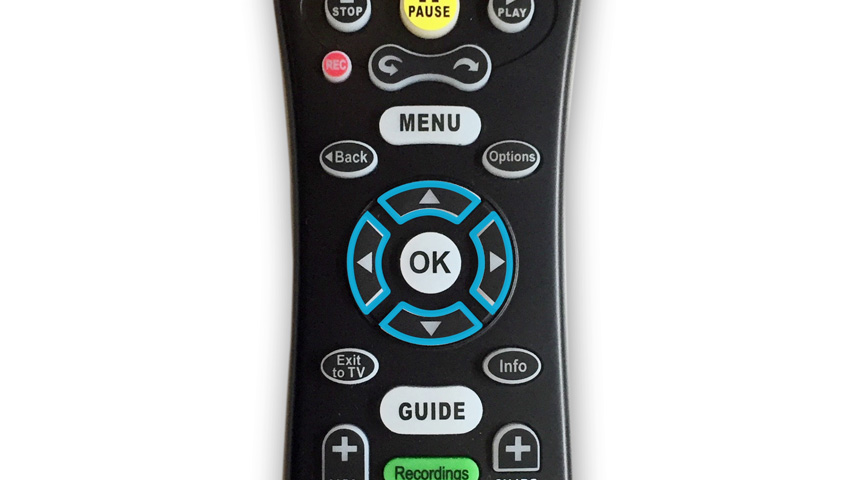
This is the initial screen I attempted to navigate to. In most cases, with competing remotes/products the back button is illustrated as a curved arrow, signifying moving back one step, or simply the word “back”, as seen on the AT&T remote below.
This is an example of poor consistency and standards, because never before have I seen another remote with a similar button image.
Because both of these buttons have created frustration, the user (me) has been turned off from using it. I also had wished there was help and documentation provided with the remote. As we know, a desire for help and documentation is not necessarily a good thing when it comes to a product, especially when the user has not felt this way about competing products.
j01 - The Downfall of the Apple TV Remote
Mary Jendricks 3/7/23
In my family’s home we use the Apple TV console and remote. Typically we find all Apple products to be seemingly easy to use and consistent with each other. We made the switch to Apple TV from AT&T. The Apple TV remote is very unique, mainly due to its small size, lack of many usual buttons, and the use of a trackpad.
Below is our previous AT&T remote:
Below is our current Apple TV remote:

Because the Apple TV has very few buttons, and a trackpad, the learnability was very quick. When using a TV remote, my goal is to be able to easily switch from app to app, channel to channel, navigate to the main menu, navigate to my library, go back, etc.. Typically, remotes become something a typical user (me) can use without looking at, thanks to muscle memory.
However, the Apple TV remote fails the user with the button named “Menu”. The Apple TV remote has poor consistency and standards here. Typically, with a remote or ‘menu’ command, the user expects to be taken to the main menu, or a home screen. This is not the case for the Apple TV “Menu” button. When first using the remote while being inside an app, I expected the “Menu” button to take me to said app’s menu or sidebar. In reality, I was just taken back a step to the field I was previously in. The “Menu” button actually only acts as a “back” button. In most cases, with competing remotes the back button is illustrated as a curved arrow, signifying moving back one step, or simply the word “back”.
As a user, this quickly becomes frustrating, no matter how equipped I become with the remote. If I were to want see a menu, or reach the Apple TV home/menu, I would need to utilize the button next to the “Menu” button. This button has an image of a small monitor/screen. This is another example of poor consistency and standards. Never before have I seen another remote with a similar button image.
Because both of these buttons have created frustration, the user (me) has been turned off from using it. I also had wished there was help and documentation provided with the remote. As we know, a desire for help and documentation is not necessarily a good thing when it comes to a product, especially when the user has not felt this way about competing products.