ux-portfolio-marcogarciamuro
User Experience Review: Samsung TV Remote
By: Marco Garcia Muro, May 17, 2022
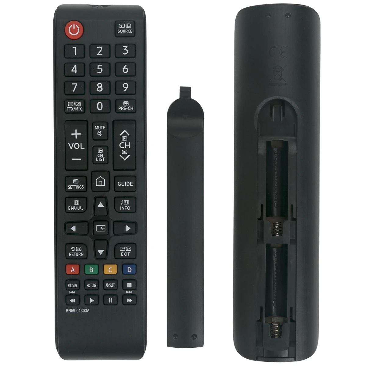
A T.V. remote is something we use all the time but think very little about the way in which it is designed. This specific Samsung brand remote for my smart television has a very aesthetic and basic layout. It uses iconography that most are accustomed to. The power button is very noticeable and recognizable, and its use is very intuitive. The home button denoted by a home icon is used to go back to the main home application and bring up the application navigation menu. The efficiency of this device is great because all of the buttons are mapped to a few actions. Within a few button presses, one can accomplish their goal whether that be by using the arrow buttons to move around through a screen or changing the volume or channel. This remote also has great natural mapping because the controls do what is expected of them. It follows physical conventions, for example, increasing the volume and channel number is done by pressing up on their respective buttons. It would be terrible if you would need to press downwards to accomplish that goal. This device is very useful as it allows you to control the T.V. from a distance and not have to use buttons that T.V.s usually have on the bottom. The physical shape of the remote is a great affordance as it fits in one’s hand well and most buttons are reachable by simply using one’s thumb.
A small detail I noticed but a nice feature to have is, that there are small grooves along the important buttons like the power button, and to the sides of the volume and channel buttons. Perhaps this was added as a way to help certain individuals locate important controls without having to physically see the remote but instead use their sense of touch.
Although pretty standard but definitely important, the back of the remote has a cover for the batteries. This serves a couple of uses. First, it keeps the batteries snug and denies them from falling out. This is a great way to prevent errors because they might fall out and frustrate the user or furthermore they could fall out, unknowingly, and possibly confuse the user as to why it is not functioning. It also keeps users safe and protects them from having contact with batteries and their currents although I am sure it is very unlikely that could cause physical harm.
Something new I discovered from doing this usability test is the playback buttons located at the very bottom of the remote. I was curious as to whether they would work for something like Netflix, and in fact, they did. I think it is interesting that I had never noticed them before. My theory for this is based on how humans scan interfaces. We tend to simply scan them and look for the important controls or data. Because the “Enter” button can be used for the same actions as pausing and playing media, that is most likely what most people gravitate towards instead of looking for a play/pause button. It is also separated from most of the more commonly used buttons making it less likely to be noticed and used.
The remote overall is such a well-designed and tested product that many do not think about how it could otherwise be implemented. It has great affordances, natural mapping, efficiency, style, and more importantly use.