ux-portfolio-marcogarciamuro
User Experience Review: MagicStrip LED Light Controller App
By Marco Garcia Muro, April 14, 2022
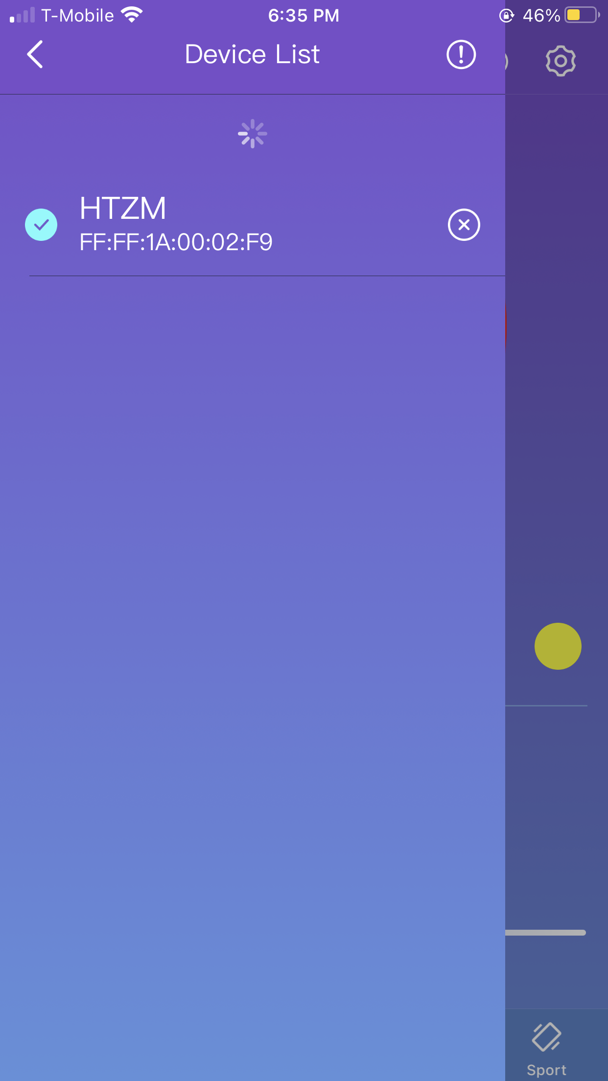
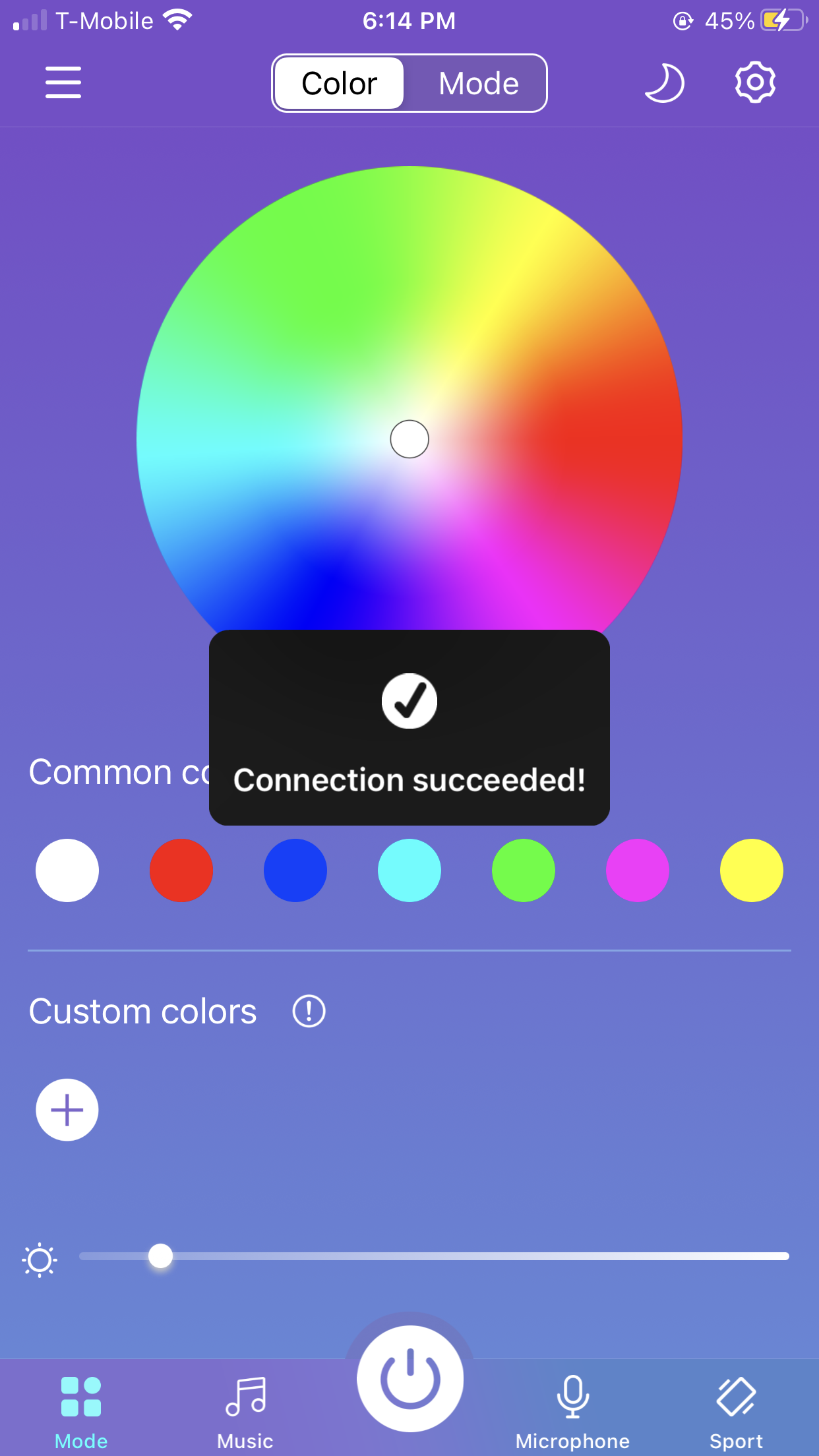
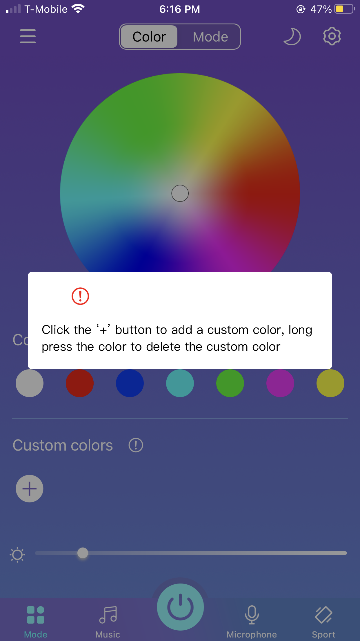
I recently bought a couple of LED light strips I connected together to put up in my room. I downloaded the smartphone application to control them via Bluetooth. I had low expectations of the lights I bought for cheap through amazon, but to my surprise, my user experience was great. When the app is first opened you are met with a big color wheel, some popular color choices, as well as an option to create a custom color based on desired RGB numeric values. If Bluetooth is turned on on the user’s phone, they can then go to the hamburger menu and connect to their LED lights. After successfully connecting I received some feedback (confirmational visual or message after the action was performed).
The LED light strip that I purchased came with its own physical remote for the lights but I often misplace it or it might be simply inconvenient or a hassle to grab it from where it is. Because I usually have my phone near me or on me, I find this app extremely useful to quickly change or turn on/off my lights.
The app does a great job of being tolerant of errors. If you chose a color and would like to change it, the color first of all quickly reflects on the lights, so you could then simply choose a different color from the color wheel or the popular colors.
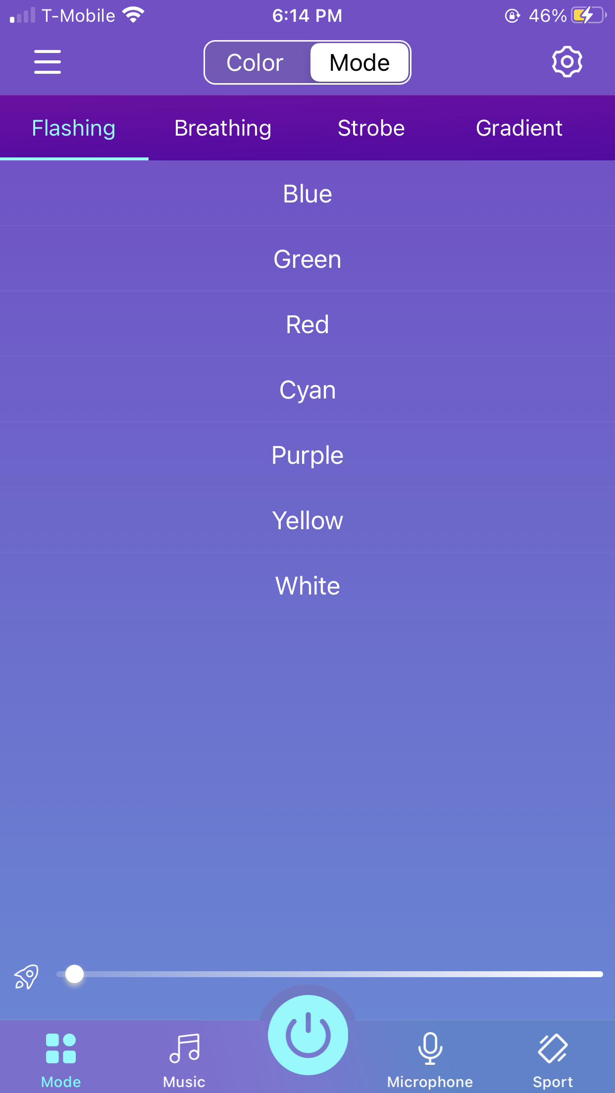
Because the controls on the app are well mapped due to the simplicity of the actions they should perform, the application is very efficient. I was able to change the light of my LED lights with a couple of touches. I can quickly toggle power with the power button at the bottom center of the app. Changing the brightness of the lights is also very quick as you can quickly adjust the brightness with the slider provided. Although the app overall is very efficient, there is a quirk with the brightness slider. If you have chosen a light mode or light pattern (flash/strobe/breathe/fade), the brightness slider affects the speed or rate of that pattern and not the actual brightness of the lights.
While the normal steady light mode or some of the more calm light patterns like breathe or fade are not harmful, the flash or strobe modes could harm individuals sensitive to flashing or flickering lights. More specifically, it could trigger seizures for those photosensitive individuals. The app contains no warning or caution about the possible effects of choosing some of the available light patterns. Therfore, for this scenario, the app could be considered to not be safe.
The app does a great job of employing natural mapping (a design in which the outcome is what the user expects). The color wheel picker is able to be simply touched to pick a color right away, or the user drags their finger around the wheel, allowing them to fine-tune their color choice. The slider on the brightness functions by touching and sliding it either left or right, which is how a person would normally expect a slider to work. Although it is not known off the bat the effect that moving the slider in a certain direction does, it is easily learnable because you can quickly experiment with the directions. A nice addition would have been to add an icon not only to one side of the slider but to both, making it easier to know the effect of moving the slider in a particular direction.
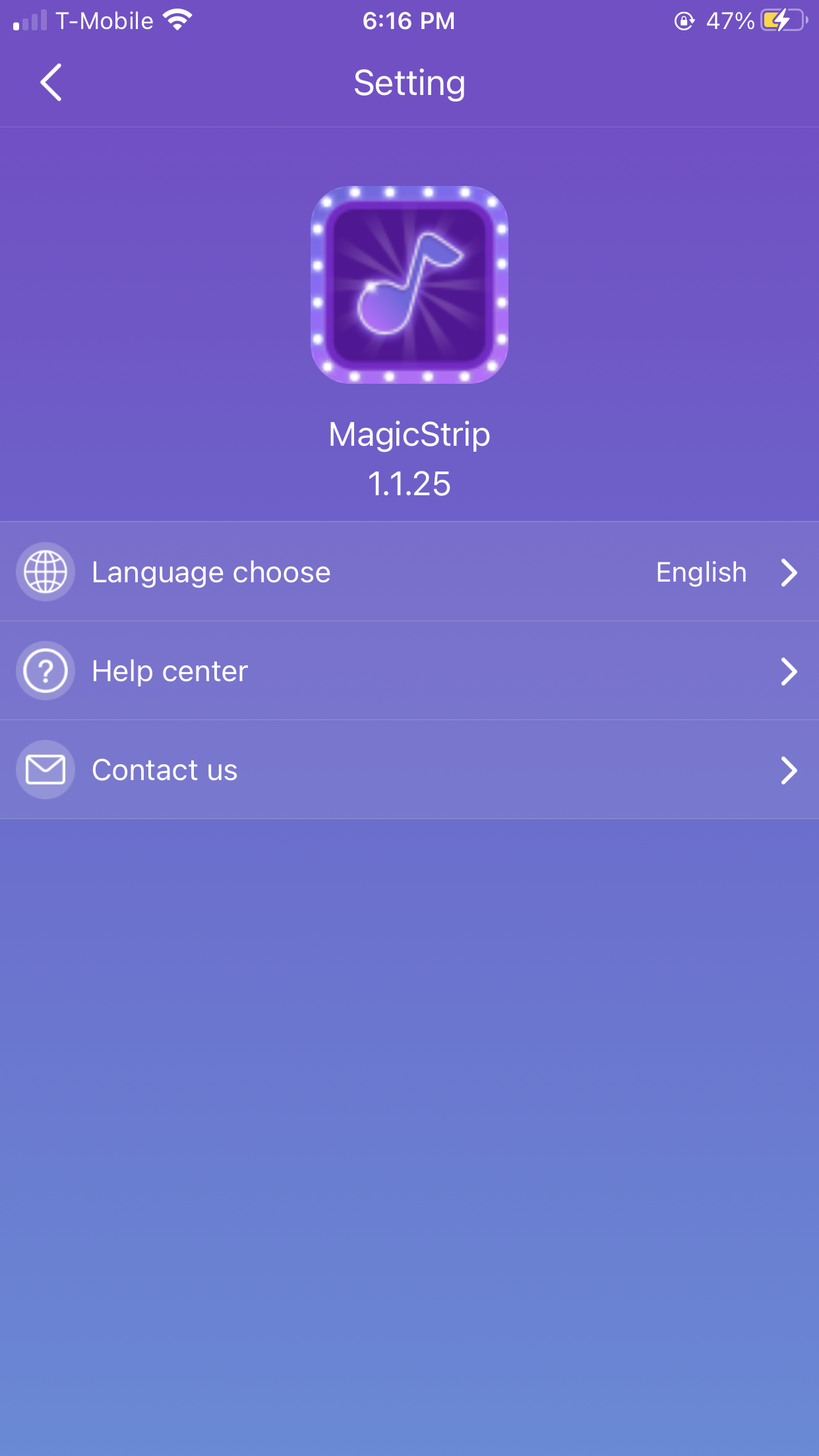
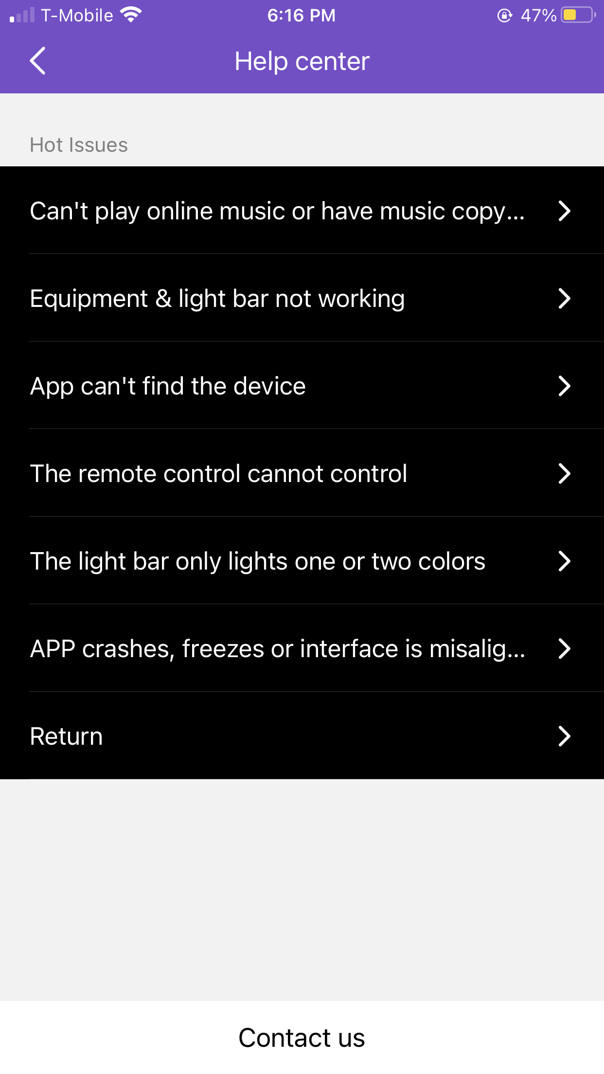
A heuristic (metric for evaluating the quality of something) that I thought would be appropriate to apply to this application was the Help and Documentation from Nielsen. I was surprised to see that this application had some sort of help section. Specifically, it includes help for common issues users might face, and if it is the case that their concern is not listed, a contact us button is available which redirects to the mail app which automatically brings up the creation of a new email with the destination address and subject line filled, which is very neat.
The app also makes great use of metaphors (comparisons between real-life actions/experiences and an item) through common iconography. For example, it uses the plus button to denote the ability to click and add something. It also has a power button which most of us are familiar with and knowledgeable of what it does. There was a Night Mode button represented with a moon that I had not noticed before and decided to try. It increased the brightness of the lights by a bit. I was skeptical about what it would do because in other applications or scenarios the night mode or moon icon, usually means to reduce noise, this did the opposite which I can see why, as if it is nighttime, the user might want to increase the brightness of the lights.
Overall, I was impressed by the simplicity and easy use of this application due to the great UX concepts and goals they implemented.