ux-portfolio-anlee
The Apple TV
By Allison Lee, 04/15/2022
The Apple TV is one of the worst streaming devices I’ve ever had the displeasure of using. I went over to my grandparents’ house to download Discovery Plus on their device so that they could watch their favorite survival and cooking shows, but looking at the remote confused me. The physical design of the remote and box may seem appealing at first glance for its minimalistic design, but every other aspect of the design is difficult to use and navigate.
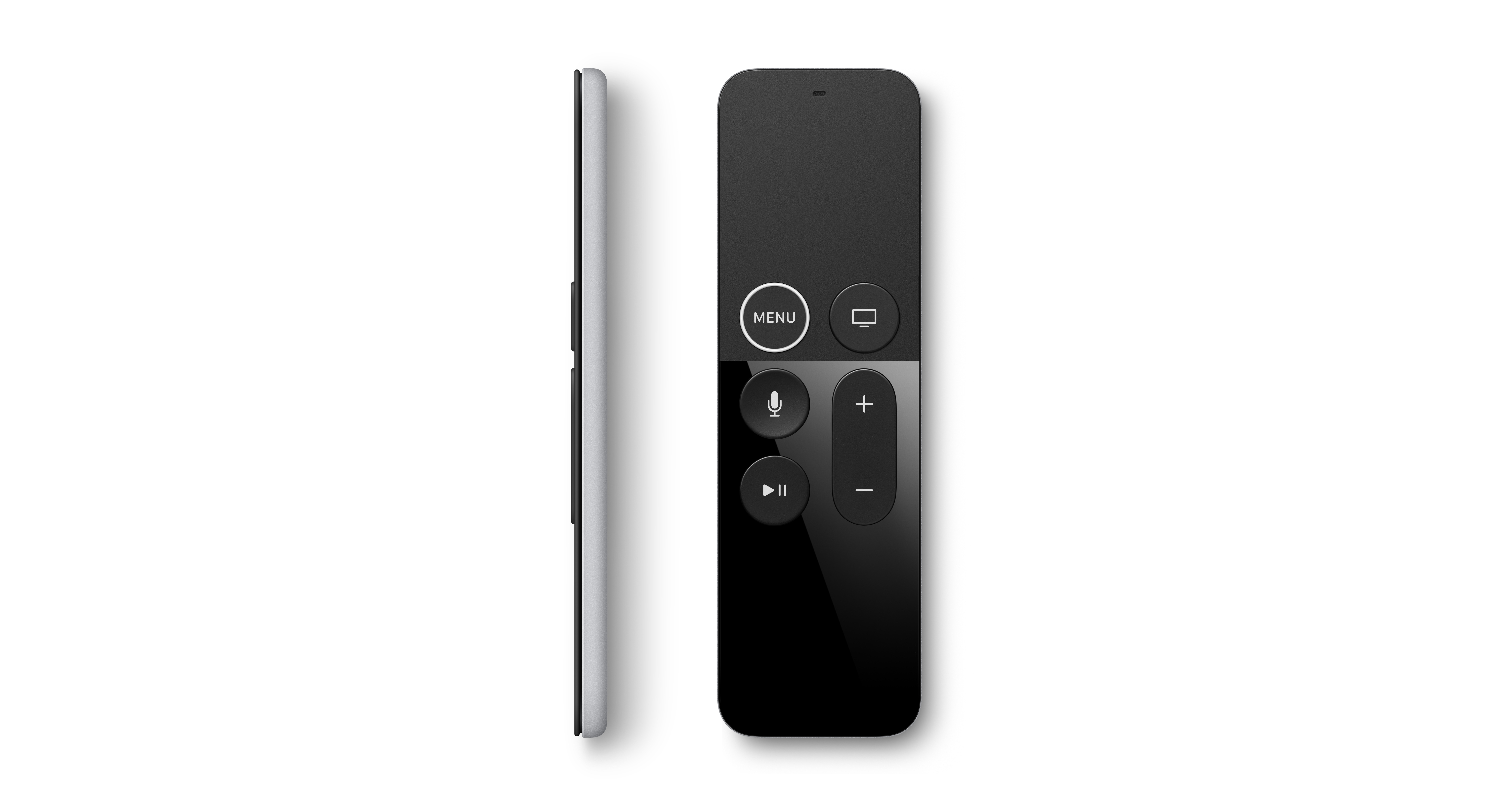
In terms of the remote, there is no clear D-pad, which is the series of buttons placed in a cross design to navigate up, down, left, or right, or even a designated “OK” button that users can press to confirm their choices. Instead, the remote relies on the user’s knowledge of using natural gestures, swiping right to go right, swiping left for left, and so on, similar to a trackpad on a laptop. Understandably, there is most likely a tutorial when using the Apple TV for the first time for how to use the remote, but as someone who used it for the first time at someone else’s house, using the remote was not learnable. Learnability is the ease in which a product can be picked up and understood by users the first time they encounter the interface. Both my grandparents and I struggled to use the remote and understand the Apple TV interface.
The scroll and navigation is also dependent on how hard you swipe as well as how long you leave your finger on the edges; I find it far too sensitive, especially when I think of my grandparents trying to use this system. As my grandparents have a slower reaction time, they find it difficult to scroll left and right for shows. Trying to navigate to a specific app or option on the screen can be difficult in that sometimes you might scroll too far or too fast and have to correct it.
Additionally, this remote does not have a “back” button or a “home” button that many other streaming device remotes may have. Instead, there is a button that says “menu” and a button with a symbol that represents a screen or a TV. I initially thought the TV button took me back to the home screen. However, it takes me to the Apple TV app instead, and for a long time, I confused this screen as the home screen.
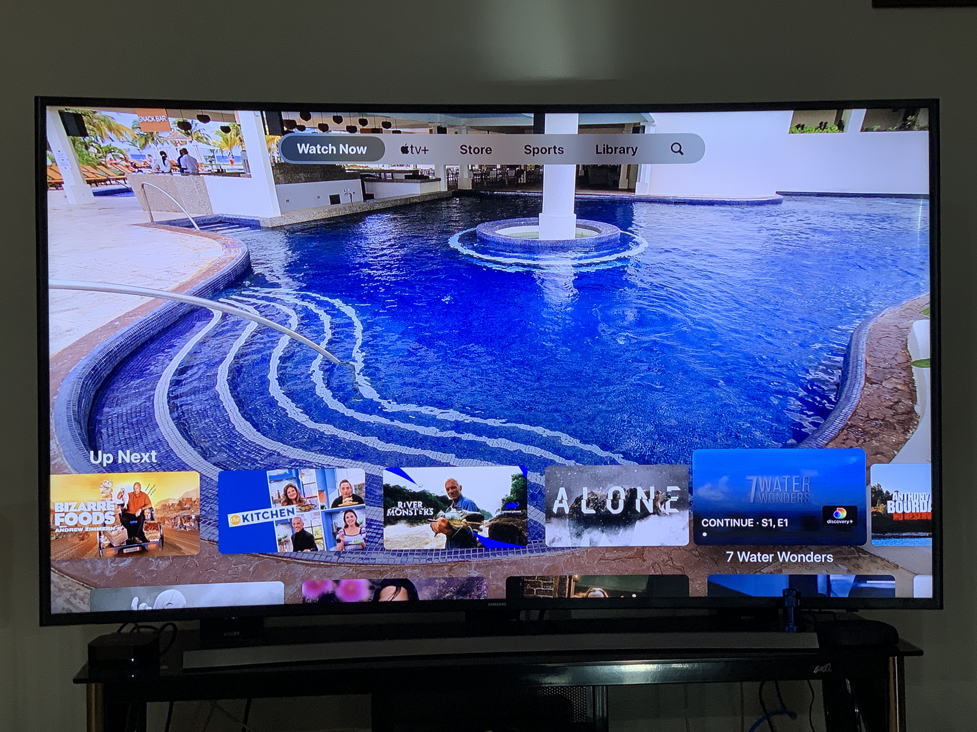 Figure 1: What I Initially thought was the Home screen when I pressed the TV screen button on the remote
When the TV button is clicked, it displays the screen shown above. At first, I was skeptical that this was the home screen because of how the cluttered the layout seemed, with shows everywhere and autoplaying in the background. But I was convinced that it was in fact the home screen because of the tabs at the top, “Watch Now”, “Apple TV+”, “Store”, “Sports”, “Library”, and a magnifying glass. As mentioned before, I wanted to download the Discovery Plus app for my grandparents, so assumedly, my first reaction was to navigate to the store tab. That was a mistake because it only takes me to the Apple TV store page, where you can rent or buy movies. I tried using the search feature thinking that I might have to search for the channel, but that also only pulls up shows or movies.
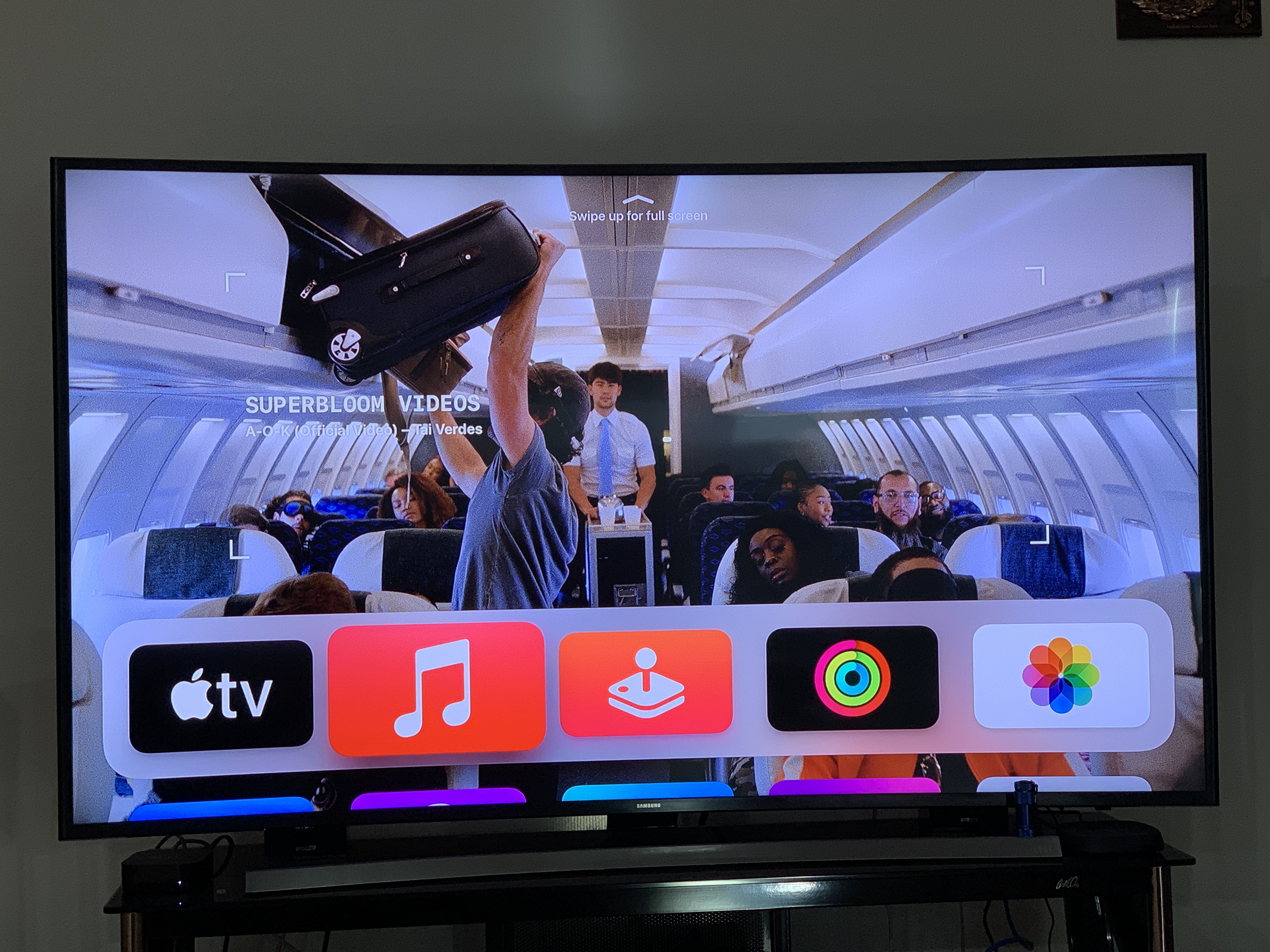 Figure 2: The actual home screen for the Apple TV Interface
Thus, I tried clicking the “Menu” button, seeing as this the only other button that would make sense in this situation. This takes me to the screen shown in Figure 2. I learned that the menu button is considered the back button on the Apple TV remote, which goes against several conventions of other remotes. Conventions are ways in which tasks or activities are usually done, and in this case, many streaming device remotes have a button with an arrow pointing left to indicate that the user is going back one step before and a home button to return to the main page. For me, I did not interpret “Menu” to be the back button, and if users have to play a guessing game to determine if they are making the correct decisions, this is not good user design.
The layout of this screen resembles a lot like the app system on iOS devices, where it is organized with the more important apps highlighted in a grey box and the other apps below it. Now, I’m beginning to understand how the operating system works due to owning an iPhone and the apps and layout seem familiar to me. Having to figure out just where the home page was located was completely unsatisfying. It went against knowledge I originally had about other streaming devices and did not carry out the same conventions in terms of design of the screens as well as the remote. The Apple TV relies heavily on your knowledge of owning an iPhone and being familiar with the default apps. In order from left to right, the apps currently displayed on the screen are the Apple TV app, music app, games app, fitness app, and the photos app. The first three are effective in that the symbol clearly displays its meaning. But the fitness and photos app are relying on the knowledge of being an Apple product owner, and are not as effective towards first time Apple device owners.
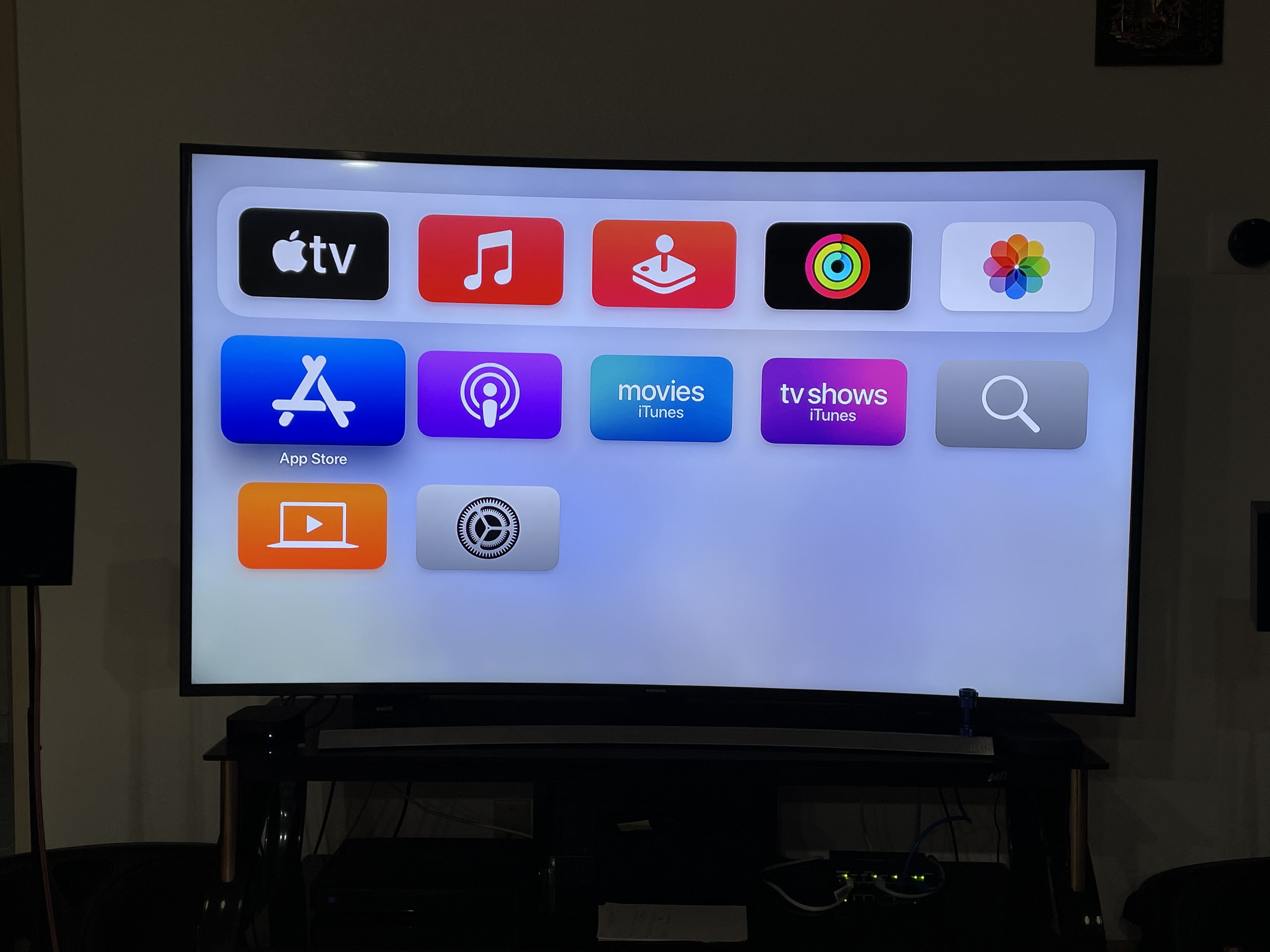 Figure 3: Selecting the App Store
The App Store logo is the standard visual that Apple uses across its products. This takes you to the store page where you can download a variety of streaming apps such as HBO Max, Peacock, and Disney Plus. I immediately notice the Discovery plus app and navigate to the icon to click on and download, as show in Figure 4.
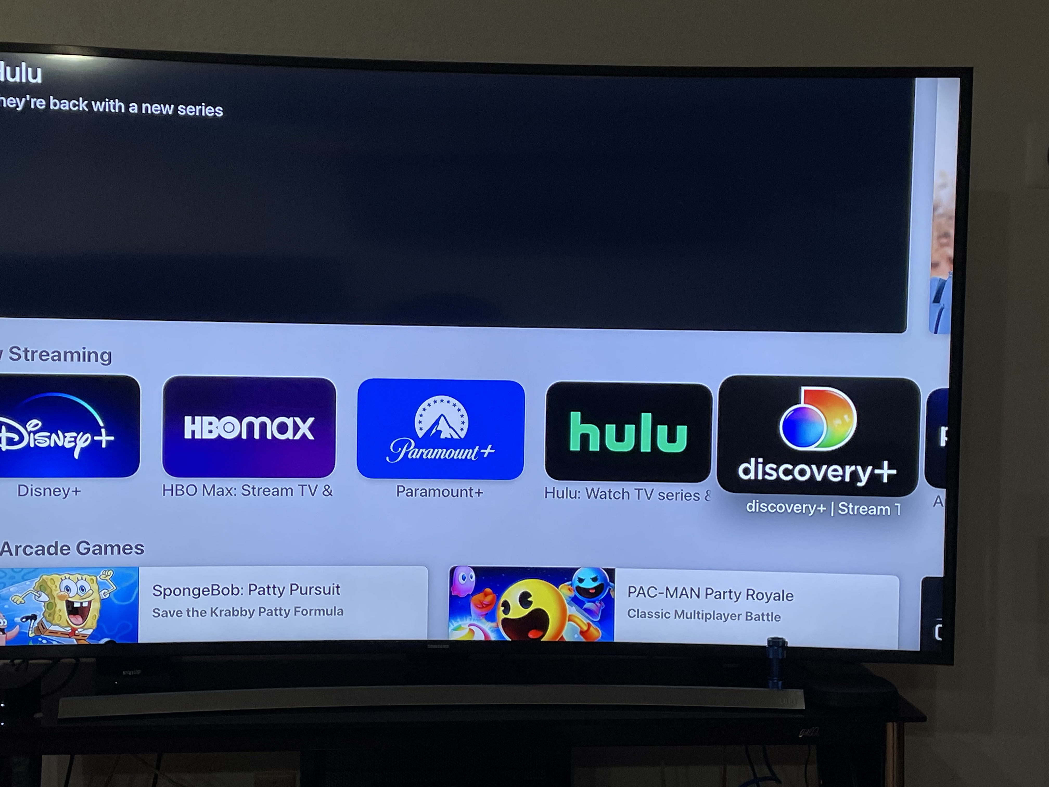 Figure 4: Selecting the Discovery+ channel in the App Store
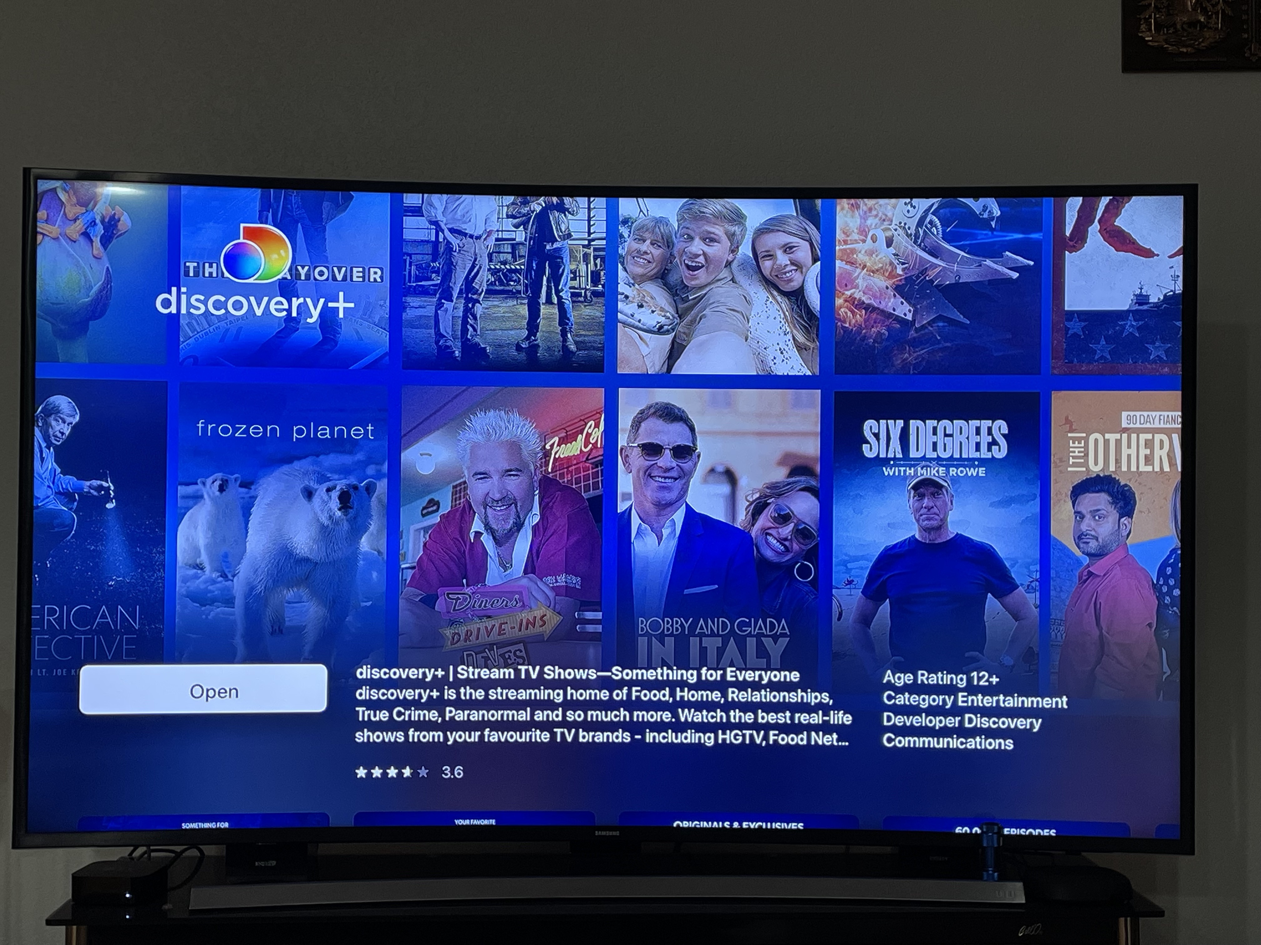 Figure 5: Download page for Discovery+
It takes me to another screen where it displays the app information, an app preview, the ratings for the app, and a button to download the app. When I click the download app, it asks to confirm the purchase on my grandma’s iPhone to use her Apple ID. I was frustrated with the extra step I had to take to find her phone and activate her face ID to approve the purchase. But afterwards, I was able to get my Discovery plus account all set up for them, showed them how to navigate the app (Figure 6), and left their house.
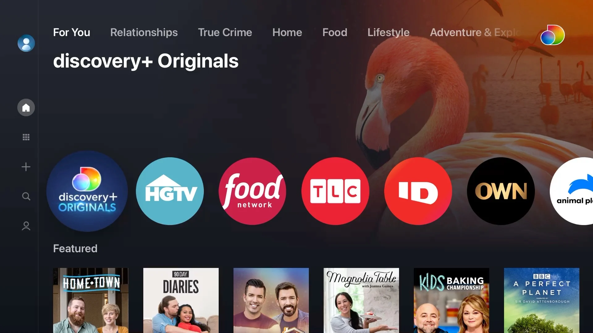 Figure 6: Discovery+ App Interface
The very next day, I get a text from them saying that they were not able to get back into the Discovery plus app stating “we can’t choose a show and the screen looks different than what you showed us yesterday.” Also confused, I go back over to their house and investigate. At this time, I still believed the button with the TV screen was the home page, so navigating back to that, I scrolled down to the large picture that says “Discovery+” as show in Figure 7.
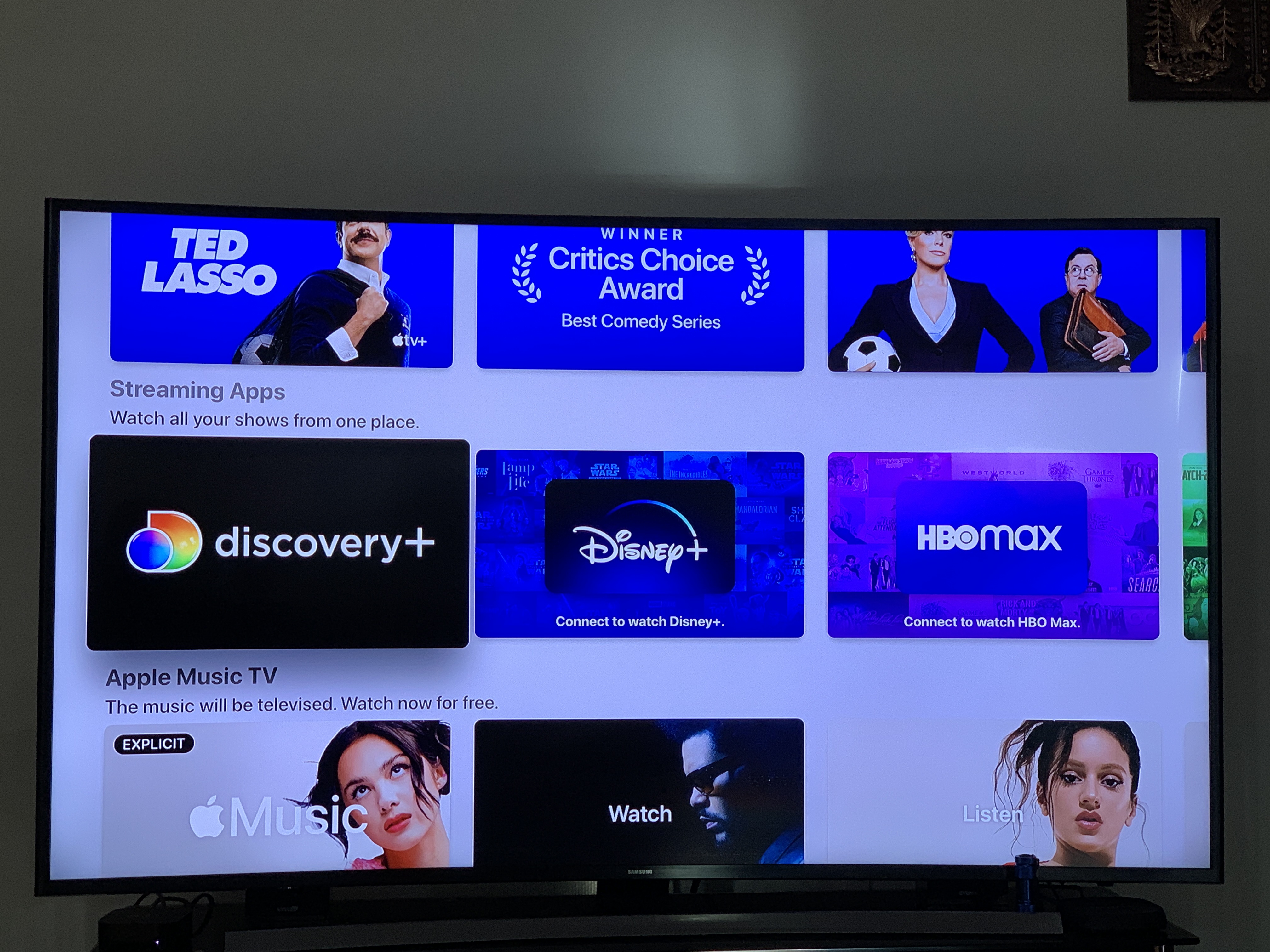 Figure 7: Discovery Plus Panel
It even tells me “Streaming Apps, watch all your shows from one place.” I click this thinking that this would take me directly to the Discovery plus app, where it would show all the channels and shows it offers, like Figure A shows. However, this leads me to a completely new page, where it no longer shows the icons for which channels are offered, or even the same layout as before. Rather it only displays tv series and shows that you can scroll through until you find one that looks appealing, but my grandparents want to watch specific shows such as Bizarre Foods. On this screen, you cannot even search for or even navigate to the channel that offers that show.
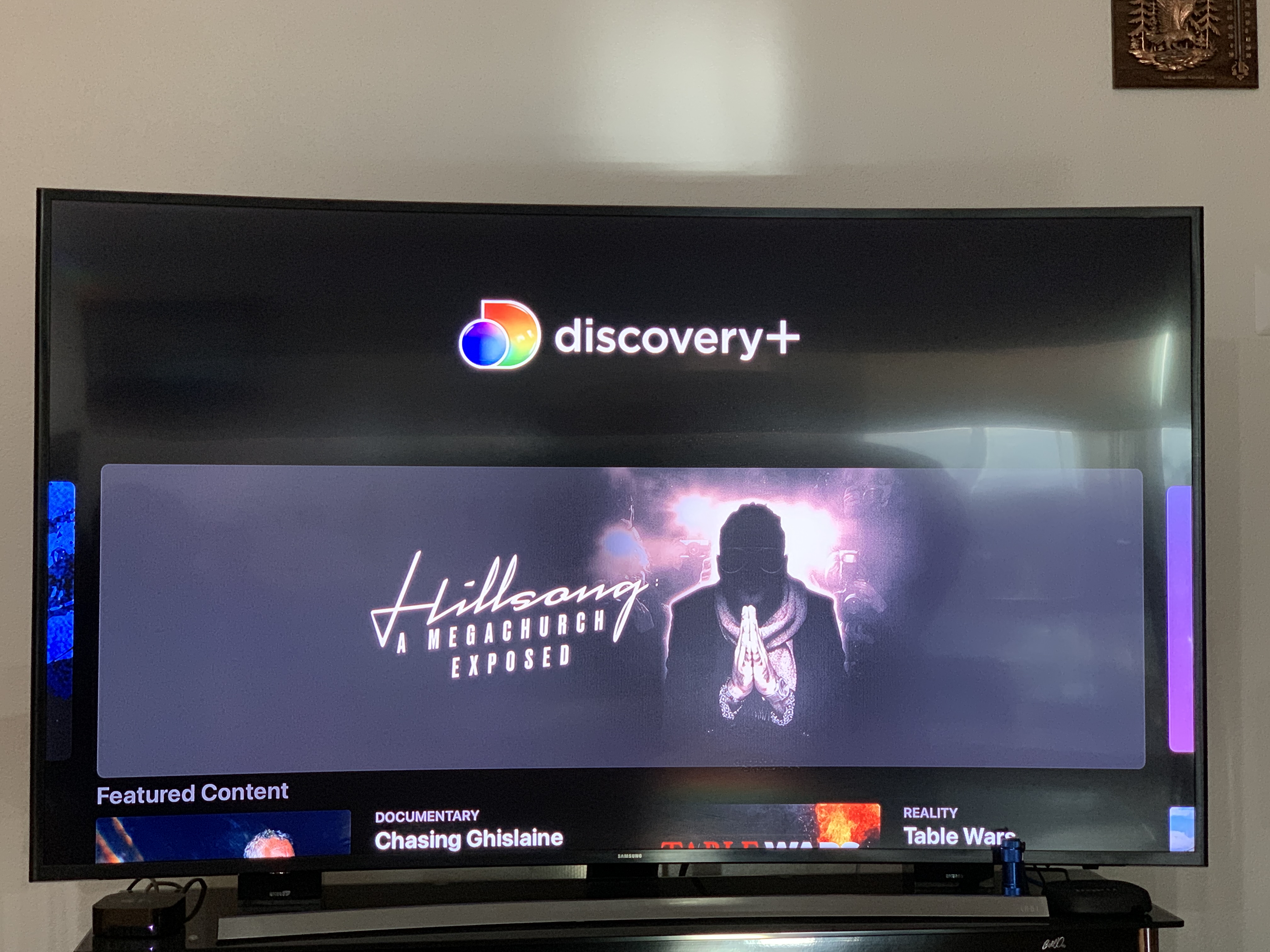 Figure 8 and 9: Where the Discovery+ panel leads to
Remembering that other screen with the app store, I finally concluded that was the home screen due to the way the apps are presented the same way on my home screen of my phone. I disliked that clicking on the Discovery+ panel on the Apple TV app did not take me to the Discovery channel. In Figure 8 and 9, it displays shows in an algorithm generated order of importance, such as “Best of” or “Featured Content.” This feature would be useful for people who don’t know what to watch and just want a variety of items, but the user could also access this within the Discovery+ app itself. Thus having two different systems for the same app is confusing.
The lack of efficiency when navigating was making me frustrated, especiall when I was constantly having to correct my mistakes. Efficiency measures the speed and how quick the user can accomplish the tasks, and I found that my experience with the Apple TV was lacking in that aspect. It took me 20 minutes to just download the Discovery+ app. Even after several visits to my grandparents’ house, I would always have to stare and experiment with the remote enough times to get the hang of it again. Even my grandparents complained that they could not figure out the system, and they only used the AirPlay feature to play Youtube videos from their iPad despite the fact that there is already a Youtube app on the AppleTV box.
These are clear weaknesses in the design of the Apple TV remote. These buttons require user experimentation before the user begins to understand the interface and remote design. A good streaming device remote would not need the user to take time to figure out its design. An implementation of D-pad buttons and an OK button are crucial to provide immediate visual feedback and would improve the remote, user interaction, and product as a whole.
The dissatisfaction both me and my grandparents had when using the Apple TV ultimately led to us buying a Roku, a competitor stream box. The user experience with the platform was confusing and unnatural. The remote, as mentioned several times, derailed from typical conventions; it had no clear D-pad or an OK button to press. Despite having natural mappings of being able to swipe in the direction you want to navigate, it wasn’t initially clear and many people would want to press down on the remote to hear a click or a button that depresses for feedback. Feedback communicates the results of any interaction. The Apple TV remote for navigation relies solely on feedback from the screen, where the user can see that swiping in a direction would move them around. However, the remote lacks in any physical feedback. A click would provide better control and feedback as opposed to the swipe motion. The visual form for remote controls lack in immediate visual feedback, as it is difficult to deduct as a first-time user that you are supposed to swipe, not click.